
The Exhibition
Currently on at the Lakes District Museum and Art Gallery is a group exhibition by three local artists, Marion Marquand, Sue Wademan and Susan Cleaver. The artists are showing colourful, intriguing work that is well worth the trip to Arrowtown to see. But of the artwork that was submitted for this exhibition, it was one that was excluded for reasons of supposed vulgarity that I found the most interesting.
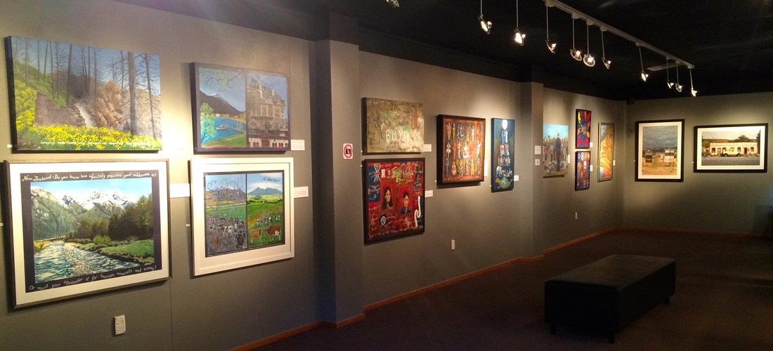
Part of the gallery showing Marion's work on the left and Susan's on the back wall.
Marion Marquand's art in this exhibition is overtly didactic. Her body of work shown in this exhibition is the most relevant to the title "Do You Care?" Almost all of her paintings include text written directly to the viewer that details the subject matter of the work. She addresses a wide variety of subjects, including ecological destruction, religion, feminism, the oppression of the poor by the greedy and urban development around Queenstown. Marion's paintings use a wide range of technique and style to suit the message that she communicates.
Marion has lived and traveled in many places all over the world. Her first hand experience of local histories and cultures and the industrialisation that inexorably changes them informs the subject matter of her work. Pictured here is "The Demise of the Divine Feminine", a large 3D multimedia work. Here she uses her direct, vivid style to illustrate goddess of creation from ancient cultures. The goddesses have been built like a relief sculptures, with each in their own partition of a shrine-like painting. The colours behind the goddesses remind me of outer space, a fitting background for these divine representations.
Marion has lived and traveled in many places all over the world. Her first hand experience of local histories and cultures and the industrialisation that inexorably changes them informs the subject matter of her work. Pictured here is "The Demise of the Divine Feminine", a large 3D multimedia work. Here she uses her direct, vivid style to illustrate goddess of creation from ancient cultures. The goddesses have been built like a relief sculptures, with each in their own partition of a shrine-like painting. The colours behind the goddesses remind me of outer space, a fitting background for these divine representations.
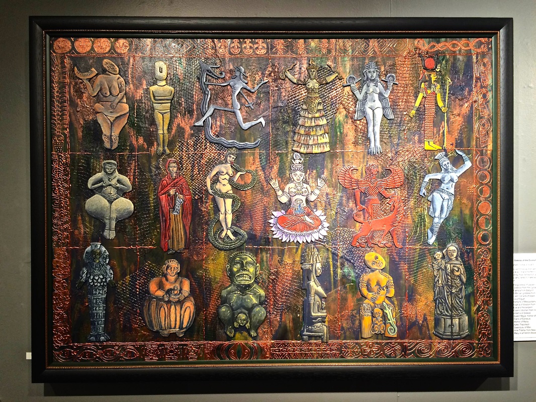
Marion Marquand's "The Demise of the Divine Feminine", 3D mixed media.
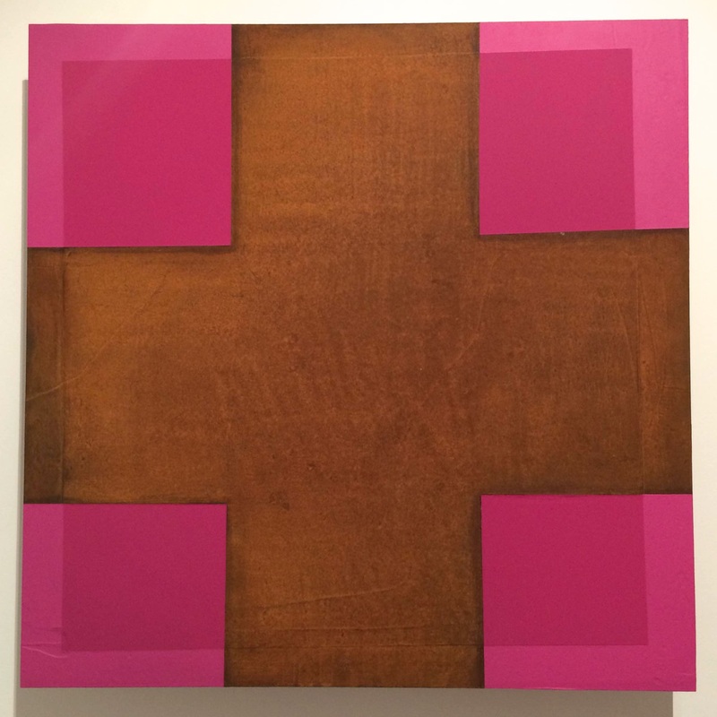
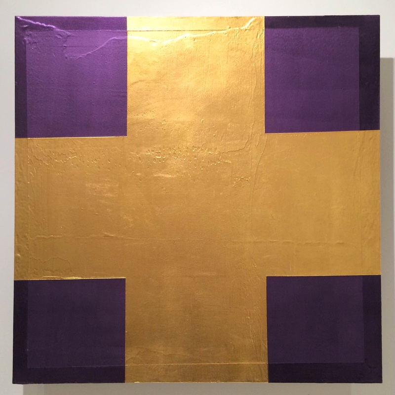
A variety of materials and surface is implemented by Susan Cleaver to show the rich colours and absorbing design of her art. She uses found and photographed images to make photo mosaics, mandala images and cut collages in her wall-hung artwork, and has had images printed onto fabric to make various household furnishings and a jewel-like peacock dress.
The back lit glass panels with butterflies and foliage printed on them attest to her technical proficiency in a range of media. A detail of one, "Blue Butterfly/Koru Fern" is pictured below. It uses image sparingly and light subtlety to give full impact to the pristine colours illuminated through the glass.
The back lit glass panels with butterflies and foliage printed on them attest to her technical proficiency in a range of media. A detail of one, "Blue Butterfly/Koru Fern" is pictured below. It uses image sparingly and light subtlety to give full impact to the pristine colours illuminated through the glass.
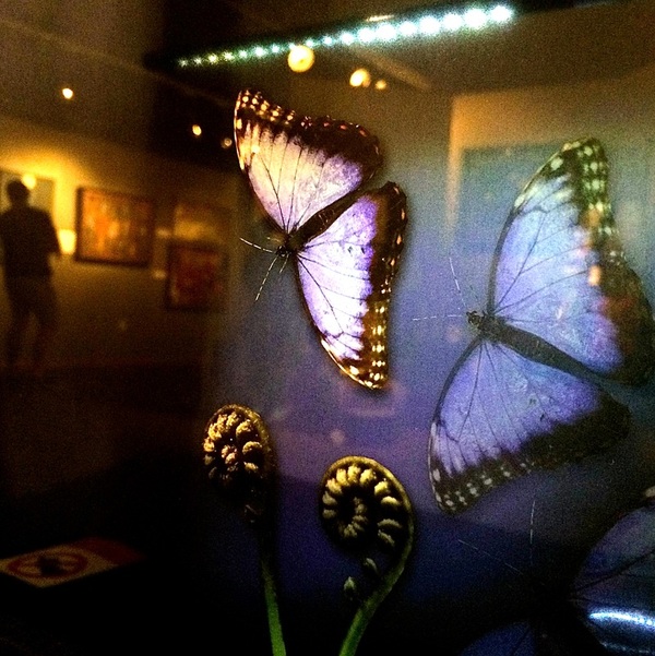
Detail of Susan Cleaver's "Blue Butterfly/Koru Fern", digital print on glass.
Sue Wademan's textiles are a delightful play of colour and light using the materials and techniques embroidery, a minority practice in the world of Fine Art. Sue's landscapes are skilfully built in large and small format, using atmospheric perspective and shimmering highlights to give depth and mood. Her large format landscapes are gently dramatic. Unfortunately I couldn't photograph any of them well due to gallery lights reflecting off the glass.
Three of her "Prayer Dresses" are also included in the exhibition. These are made from silk saris in luxurious colour and hung to be reminiscent of buddhist prayer flags.
Three of her "Prayer Dresses" are also included in the exhibition. These are made from silk saris in luxurious colour and hung to be reminiscent of buddhist prayer flags.

Sue Wademan's "Last Light", Appliqué and embroidery.
The Vulgar Painting
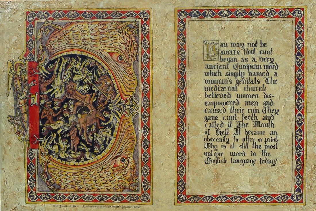
And the painting that was too vulgar to be shown in this gallery, due to school children visiting? "Why Is It the Most Vulgar Word in the English Language?" by Marion Marquand. I saw this work where it presently hangs in her studio at the Queenstown Arts Centre and found it's message very intriguing.
Marion's artist statement, a slightly shorter version of which is the text in the painting:
Marion's artist statement, a slightly shorter version of which is the text in the painting:
You may not be aware that cunt is a very ancient European word which simply named a woman’s genitals. It appears in ancient Basque, Old Norse, Old Frisian, Latin and Middle English. The medieval church believed that women disempowered men and led to their ruin. They gave cunt teeth and called it ‘The Mouth of Hell,’ as is illustrated in this miniature in the Winchester Psalter, c.1150. Cunt became an obscenity – an offence to print or utter. Why is it still the most vulgar word in the English language today?
The painting is in two halves, the right half the text and the left Marion's reproduction of a drawing in a medieval Psalter. The illustration of "cunt" on the left side shows a monster's mouth, open wide, containing demons delightedly torturing the men who have been entrapped. A solemn faced angel holds a key in the lock to this abhorrent place.
Good point Marion, why? Why is it the only word that still has some power to shock? Why does a name for anatomy distinctive to women the worst insult you can give?
Vaginas are not actually abhorrent things that only lead men to their ruin. But the words we choose are how we build ourselves. They communicate ideas about the culture we were brought up and live in. Sometimes swearwords are the right words at the time to get our point across or express the situation. But they all have original inexorable meanings that subtly affect our lives. If its not a bad thing, why use it as a bad word? Marion is asking us to be aware of our words.
Vaginas are not actually abhorrent things that only lead men to their ruin. But the words we choose are how we build ourselves. They communicate ideas about the culture we were brought up and live in. Sometimes swearwords are the right words at the time to get our point across or express the situation. But they all have original inexorable meanings that subtly affect our lives. If its not a bad thing, why use it as a bad word? Marion is asking us to be aware of our words.
"Do You Care?" is on until Sunday the 29th of March. The exhibition has been curated by the Lakes District Museum and Art Gallery to a good exhibition standard. Spot lighting is employed so that viewers are walking around in semi-darkness with lights showing off the artwork, most of which has it's own glow engineered by the artists who are skilled in light play. Prints of " Why Is It the Most Vulgar Word in the English Language?", among other prints are available, and most of the original artwork exhibited is for sale.
And check out this Shakespearean insult generator if you need some help in thinking up imaginative insults!
And check out this Shakespearean insult generator if you need some help in thinking up imaginative insults!
Do you care? How do you use the word 'cunt'? Have you seen the exhibition? What did you think? Comment below!
 RSS Feed
